Handwriting lines: baseline, middle line and descenders
Learn what the writing lines mean and choose which guides to show on your worksheet.
Writing guides show where the main parts of a letter sit. The baseline supports the body, the middle guide shows lowercase height, and the other guides help you allow for capitals and lower tails.
What each guide means
| Guide | Purpose | Example to inspect |
|---|---|---|
| Baseline | A reference for where the main bodies of letters sit | The bottom of a lowercase x |
| Middle / x-height line | The height of the lowercase body | x, a or e in the selected font |
| Capital-height line | A reference for capital letters | A or H |
| Descender guide | Space below the baseline | g, j, p, q or y |
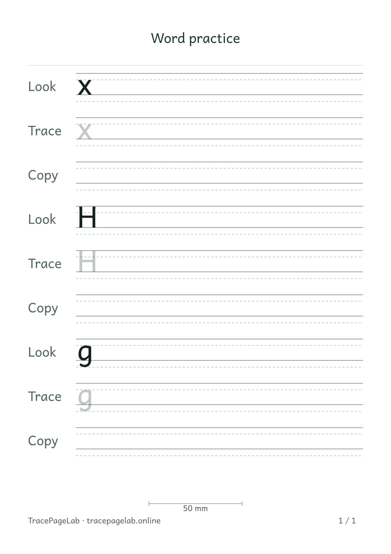
Compare the body of x, the capital H and the lower tail on g. Accents may reach above the capital-height guide.
Leave room for ink beyond the guides
The accent in Émilie sits above the capital E. Letters such as g and y extend below the baseline. Leave room for the complete shape even if you turn some guidelines off.
Choose the guides you need
Choose the guides that help with your page. A baseline-only sheet feels more open; adding a middle line makes lowercase height easier to compare. You can also show capital-height and descender guides.
Use Line darkness for the guides and Trace darkness for the pale lettering. Change one at a time and print a sample to check the contrast. Light gray can look quite different on a screen and on paper.
When lines look crowded
- Check whether the full letters fit, including accents and descenders.
- Increase row spacing if adjacent rows are too close.
- Reduce the number of repetitions when you want a shorter page.
- Match the printer paper and actual-size setting to the worksheet.